
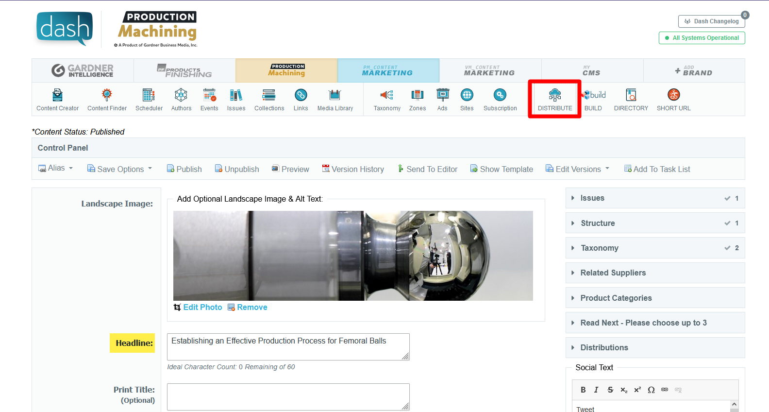
Ability To Exclude Content For Build Widgets
Within the Build Widget Content Selector is set to an automatic pull such as pulling content based on ContentTypes and Taxonomy, an additional content search box is added to prohibit selected content from being used in this widget (Applies to automatic pulls and ignored if content is manually chosen).
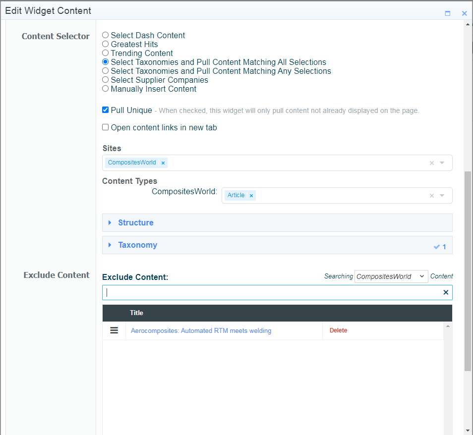
The above example is pulling all CW RTM articles, but "Aerocomposites: Automated RTM meets welding" links to the same KC so its excluded from the widget.
Distribute Metrics, Republished, and Word Count Expansion
 Tom Gobich
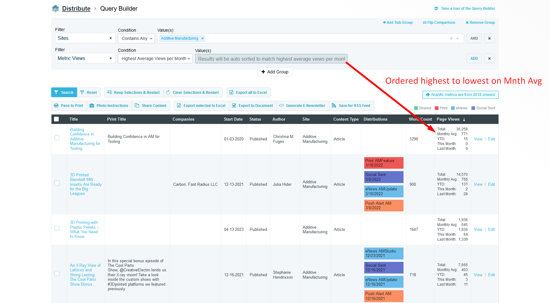
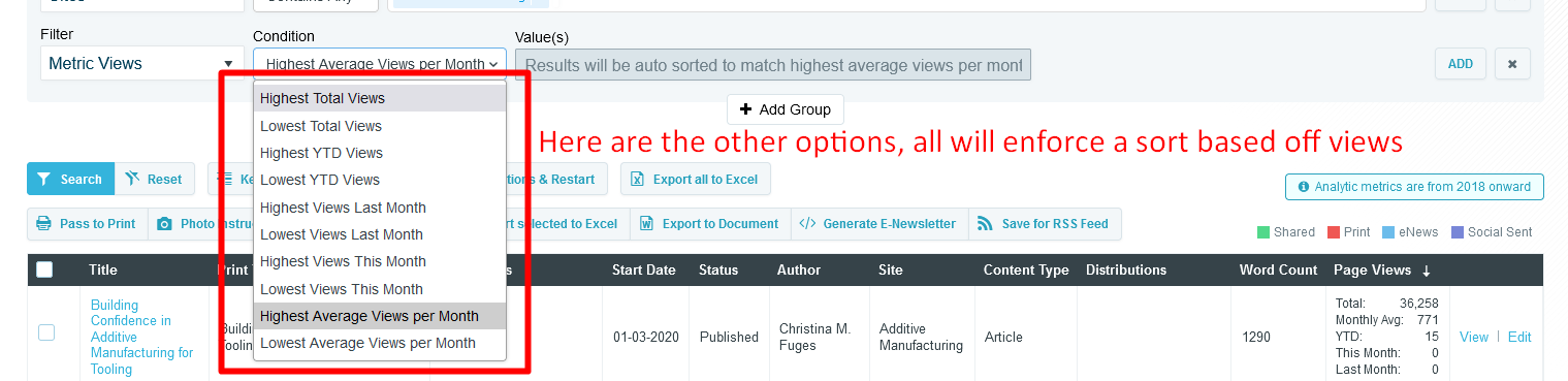
The Query Builder within Distribute now contains several new filter options
- Metric Views - Allows you to force a sort by a certain view condition, like highest average views per month
- Metric Timeframe - Allows you to specify a timeframe the metric views should use
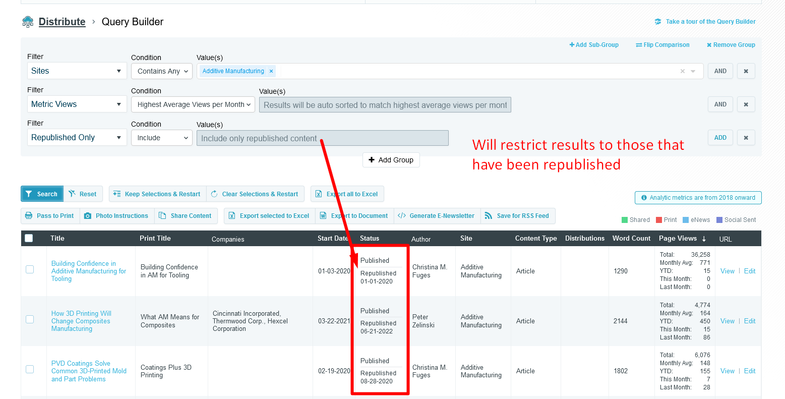
- Republished Only - Allows you to restrict the results to only republished content, or you can flip the condition and exclude any republished.
- Word Count - This one isn't new, but a new condition has been added "between" that allows you to specify your own min and max word range
A couple new view columns have been added as well
- Page Views - This includes total page views, monthly average, year-to-date, last month, and this month views. YTD, last month, and this month may or may not appear depending on any metric timeframe filter that may have been included in your query.
- Word Count - Will display the word count of the content item
- Status - This one isn't new, but will now also show whether the content item has been republished and what its republished date was.
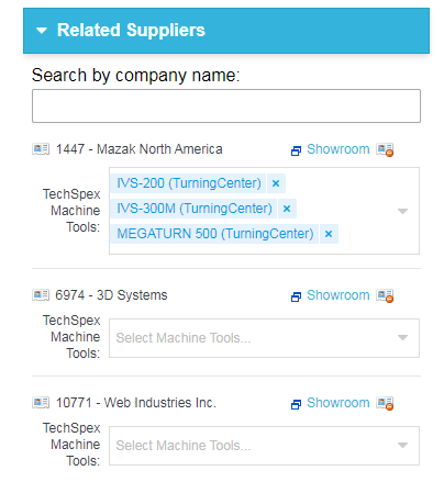
Map Content To TechSpex Machine Tools
Within the contentEdit page (EdApp), editors can now map TechSpex machine tools to the content item. These are additional tree-selectors narrowed per supplier.
Allow Multiple Sites/ContentTypes to be selected when pulling content via Taxonomy in Build
When Selecting Content via Taxonomy within a Build Widget, you are now able to select multiple sites and contentTypes. ContentTypes will be displayed when the given site is added to the sites list. It is assumed that no selections is the same as having everything selected, and selections will narrow the results.
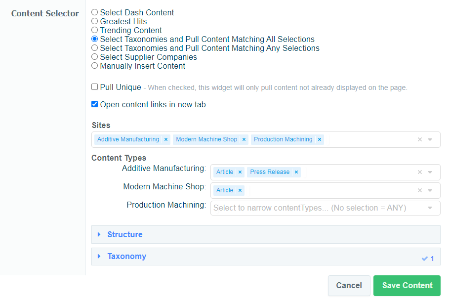
In the Above Example, we are pulling content tagged to Big G Topics -> Automation. Due to my sites/contentType selections, this will pull Articles and Press Releases from AM, Articles for MMS, and any content for PM.
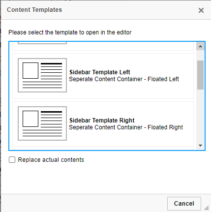
Left/Right Floated Sidebar Templates & MagicLine
Two new templates were added to the WYSIWYG templates section. These are additional versions of the sidebar template, but will be floated left or right (Similar to Images).
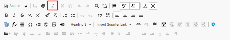
Along with this update, I also added an easy button for "MagicLine" to the WYSIWYG menu, rather than only the auto magicLine that appears within the textbox. This option should make it easier to create a new paragraph outside of any divs your current selection might be stuck in.
Adding Event Registration to Zones/Microsites
You can now add an event's registration details to the zone overview when using the 'new' landing page display (zoneDesign2) and within a 1x3 microsite widget. This can be done by creating a link between events and the chosen microsites/zoneContent pages and then choosing to display the event registration.
See the following PDF for more info on how this can be done: https://gbm.media/ChangeCrab-4-27-2023
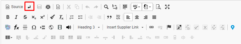
Navigate to Comment When Clicking Annotation
While the body is Maximized, clicking a comment/annotation will now navigate to the comment's position within the body.
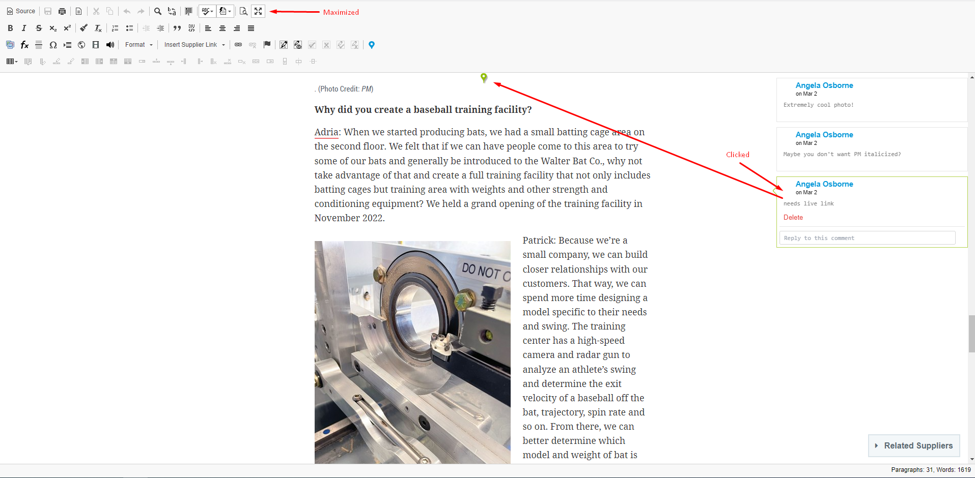
This feature is only applicable when the body is maximized as otherwise, the comment would be moved offscreen when scrolled to its placement.
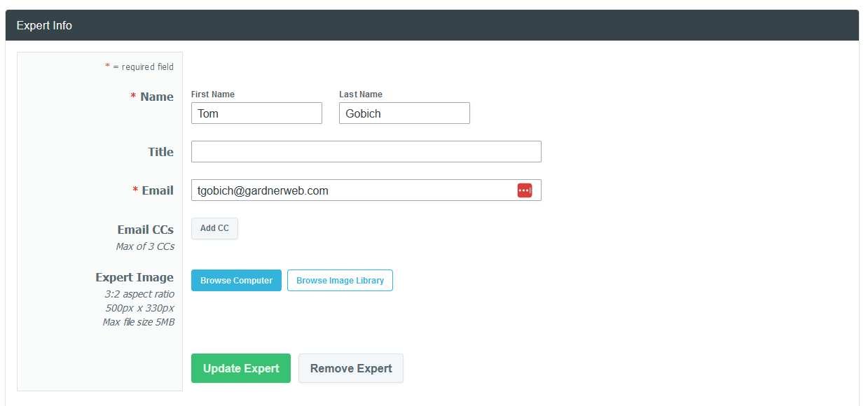
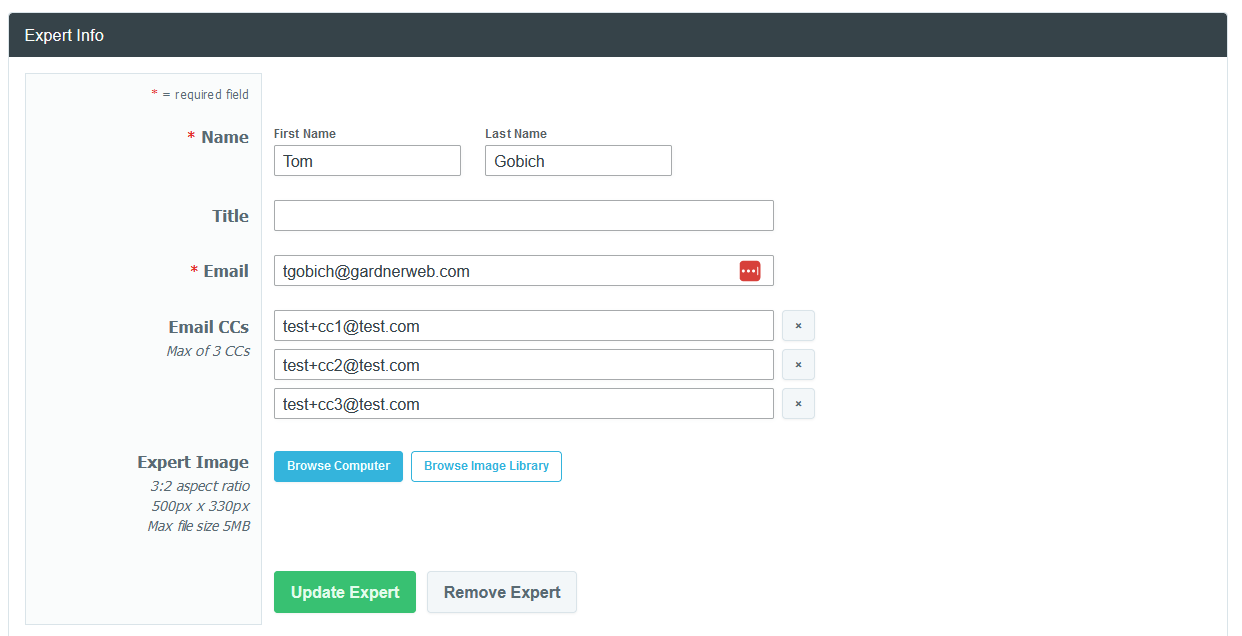
Knowledge Center Expert Email CCs
Tom Gobich
You can now specify up to three CCs on a Knowledge Center Expert within Build. These CCs will be assigned as CCs on any outgoing expert email submitted via the expert form within the Knowledge Center.
Build - Navigation Enhancement & Cache Bug Fix
Tom Gobich
Cache Bug Fix
I believe the origins of the cache bug that's been impacting some Build updates has finally been found and fixed. The bug occasionally occurred when making changes to an already cached version of a Build site (meaning it's been viewed). The change would attempt to clear out all the required cached items, but when this error happens, one of the template-level caches gets excluded leaving it with outdated information which results in an error screen.
I believe I've sourced this bug back to an alteration I made to expand Build functionality for Grow which resulted in Widget Clipboard items getting included in template cache data. This itself didn't cause the error, however, clipboard items belong to the page and not any one template, so when one template was changed, the clipboard widgets would shift but still exist in the cache of other template items, which is what ultimately led to the error.
This is now being scoped specifically to Grow, and will no longer impact the other sites. In addition to this change, I've also gone through and added additional cache clearings for the template-level Microsite caches.
Navigation Enhancement
A structural enhancement has gone out for Microsites containing a navigation bar on desktop devices. The navigation bar now spans the full height of the page and will stick to the top of the page as you scroll. To allow space for this, strip content will now start directly to the right of the navigation bar and span the remaining width.
This change was primarily made to remedy a structural issue in cases where the navigation was taller than the Template 1 content. In these cases, the navigation would cause empty space between Template 1 and Template 2 or Template 1 and Strip 1 since previously the navigation was inserted along with Template 1's content.
GardnerWeb, Gardner Intelligence, and Microsites not containing a navigation have not been impacted and will display the same as they did prior to this release.
ExpiryRedirectUrl
A new field has been added to the edApp right under the End Date field which will allow a redirectUrl to be given that will become active once the current time passes the content's End Date (Content Expires). This field is required if the End Date is within 10 years from the current time.
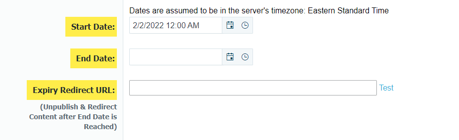
This will only come into effect once the content expires. When this happens, the content will automatically Unpublish itself and a 301 redirect will be created to the given Expiry Redirect Url. If this field does not exist, then the content will still unpublish but 404.
When the Expiry unpublishing occurs, the version history will also be updated to show this.

Unpublish and 301 Redirect
When unpublishing a content item, you can now choose to unpublish the article as a 301 redirect. Unpublish now is a dropdown where you can choose to either 404 the page or 301 redirect.
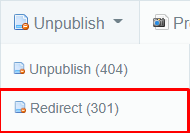
Clicking this option will open a new window that will allow you to insert the URL for which this content should now redirect to (Instead of simply returning a 404 error)
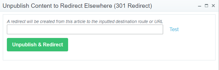
* This new option will come in handy in situations such as merging information from multiple content items into a single one. You would want to only keep the best performing URL and then you could "Unpublish and Redirect" the other items to this URL.
* If there are any existing redirects to a content item when it is unpublished, those redirects will be updated to use the same destination that is given.
* If an unpublished article is published again, all redirects sharing the same destination as the content's current redirect will instead be mapped to this content and the content will no longer redirect. Be sure to clear your browser cache!
Improved Speed for ProspectExhibitorList
/manage/ProspectExhibitorList/{ShowName} has been updated to use a Vue component to display the list of exhibitors for the given show. With this change, the speed of grid updates, such as sorting and filtering, will be much quicker.
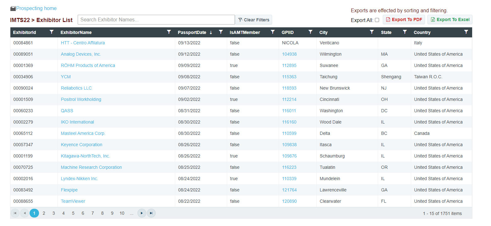
The "Export All" button will simply change whether the Exports are set to export only the current viewed exhibitor list or all of them. The button will no longer display all exhibitors as a giant list because of the slow-down. When displaying all records at once, updates to the grid will take multiple seconds each instead of the near-instant results found using the chosen implementation. It is important to note that the sorting and filtering are carried over to the exports as well.
Any column can be filtered and sorted on. The search box above the grid will update the filter on the ExhibitorName column. By default, the filter type will be looking for exhibitor names that "Contain" the given input text, though will use the currently selected filter type if the option is changed.
Individual filters can be cleared by using the "Clear" button in the column's filter dropdown. The "Clear Filters" button above the grid will clear all filters from the grid.
The Exports were also updated as well. The exports will either export the currently displayed or all exhibitors (After Filtering and Sorting).
The Excel Export should be seen as a total improvement as it will now export as an .xlsx file instead of .csv giving more features in the export. With this change, the headers are now sortable and filterable from within Excel as well. (Once again... just a reminder that filtering on the grid before exporting will limit the exhibitors shown in the exported list). The column sizes are also defined so should be more easily read.
The PDF Export will result in a well-formatted pdf file, though there is an unfortunate side-effect from the grid's speed improvement changes. Because the Export All option has the export render the full list of exhibitors in the background, the PDF Export may be a bit slower and will cause the page to become frozen and unresponsive. The time is dependent on the number of total rows being exported. For reference, an export of 1750 items took about 40 seconds.
Distribute Photo Instructions & Export Document
Tom Gobich
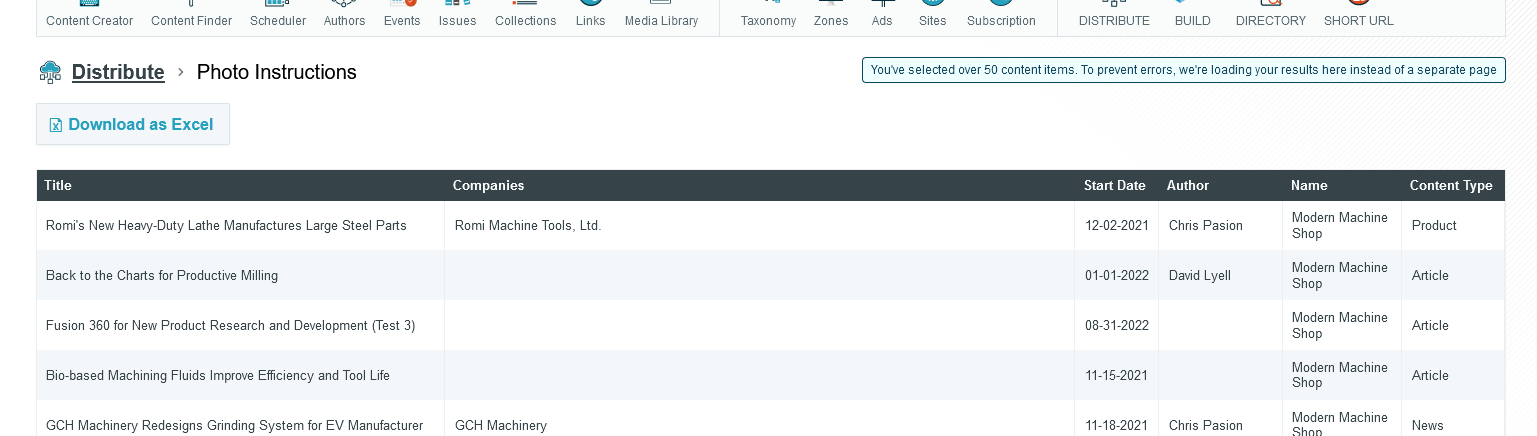
Distribute has had an issue where if you select near or over 50 content items, you'd run into an errored page due to the length of the URL exceeding the allowed character limit.
This issue has now been fixed for the Photo Instructions and Export Document actions, as these are the two actions most likely for this to occur.
If you should select under 50 content items, these actions will behave as usual by opening the results on a new page where they can be re-ordered and exported. However, if you select over 50 content items, these actions will now be loaded on the same page to bypass the URL character length limitation. You'll still be able to re-order and export the items. When this occurs a note will be added to the page to signal this was intentional and not without reason.
Distribute Published Content Alteration
Tom Gobich
The default behavior of Distribute's Query Builder has been altered. Previously, the default behavior was to display live, published, content only within the results. Then, you could allow unpublished & future-dated content via the "Non-Published" filter. This behavior has now been flipped.
Now, the default behavior is to display published, unpublished, and future-dated content. Then, you can apply the "Published Only" filter to restrict results to live, published, content. This filter will be important to apply, for example, when creating an RSS Feed you intend to share or pull content from.
Additionally, we've now also added an actions column to the results. With these actions you can "View" the live content, "Preview" not yet published content, and open the content within the Editorial App by clicking "Edit". Note, unpublished content no longer contain a "View" link in the content header nor the action column since the resulting page would be a 404.
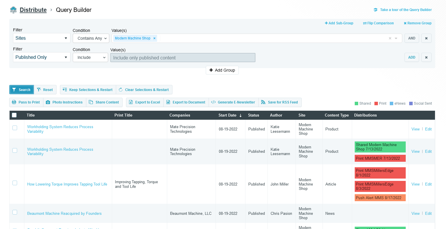
Above you can find an example of a Query Builder restricting the results to Published Only content. You can also see the new action column, the right-most column.
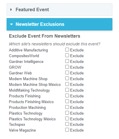
Events ExcludeFromNewsletter
The Events and Webinar Edit Pages now have an additional card for excluding the event from Newsletters. Simply check the boxes for the site's newsletters that should not display the event.
This comes into effect when a newsletter is grabbing events from a particular site. The ExcludeFromNewsletter field for the given event-to-site relationship must be false to be chosen.
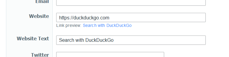
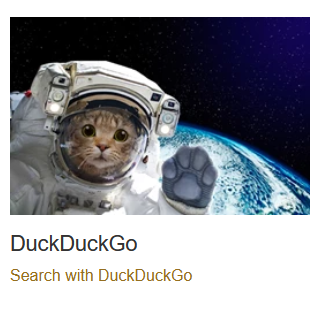
Build Manual Company Website Text
Tom Gobich
A new field has been added when entering manual companies into a Build Microsite, called "Website Text". When provided, this text will be the displayed value for the "Website" link provided.
Essentially, this will allow you to specify the call to action text for a company's website link.
Distribute Updates & Fixes
Tom Gobich
Fixes
- Fixed an issue with the Query Builder where OR statements applied to the same group didn't work properly. This was accidentally broken as a part of yesterday's updates adding the Non-Published filter.
-
Fixed
an issue with the Query Builder where future dated published content
was getting included by default. Future dated content should've been restricted
to when the Non-Published filter is included in the query builder.
Updates
Improved the way errors are handled. Prior to this update if the Query Builder was converted into invalid SQL, zero results were returned for the query and no notice of an issue was given. Now, an error is captured and displayed (as shown below). This is now also being logged for us developers with information about the query so that we can easily replicate what led to the error.
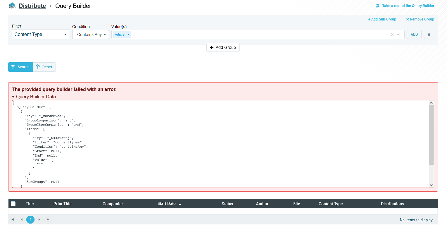
The above error was forced for demonstration purposes.
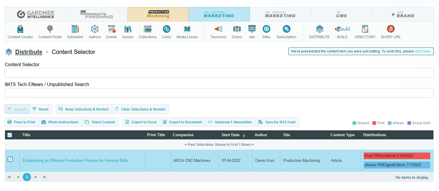
Distribute Preselection from Editorial App
Tom Gobich
When you travel to Distribute from the Editorial App, Distribute will now load up with the content item you were editing in the Editorial App preselected within the Content Selector of Distribute. From here you can either add more items to your selections or go straight into one of the inner functionalities of Distribute.
You can easily undo this preselection by clicking "Clear Selections & Restart" or clicking the call to action in the alert in the top-right corner of Distribute. This alert is only displayed when this preselection occurs.
Bulk Upload & File Size Limits
Tom Gobich
The bulk upload behavior on the Content Creator and Media Library has been altered. Previously, when you selected multiple images to upload all of the selected images would be grouped and sent up in a single request to upload. We've noticed this can result in an error due to the single request's size being too large if too many or too large of images are uploaded.
As a remedy the bulk upload will now upload each selected file individually. The only change you should notice here is that multiple files will no longer be grouped but rather listed individually.
Additionally, we've also added validation onto our uploads, including the bulk upload, to restrict image sizes to 5MB or less. We've noticed some images between 15MB to 30MB being uploaded, which is very large for a single image upload.
Ad (Variant) Preview
A new button has been added to the AdEdit page that will allow the Ad to be previewed. This should give a preview for how to the Ad should look within newsletters or the websites. Clicking on the ads still work as links but don't include UTM Parameters (if they exist). The link included UTM will be given as text under the Ad.
This option is available for Standard, Video, and Hybrid Ad Types.
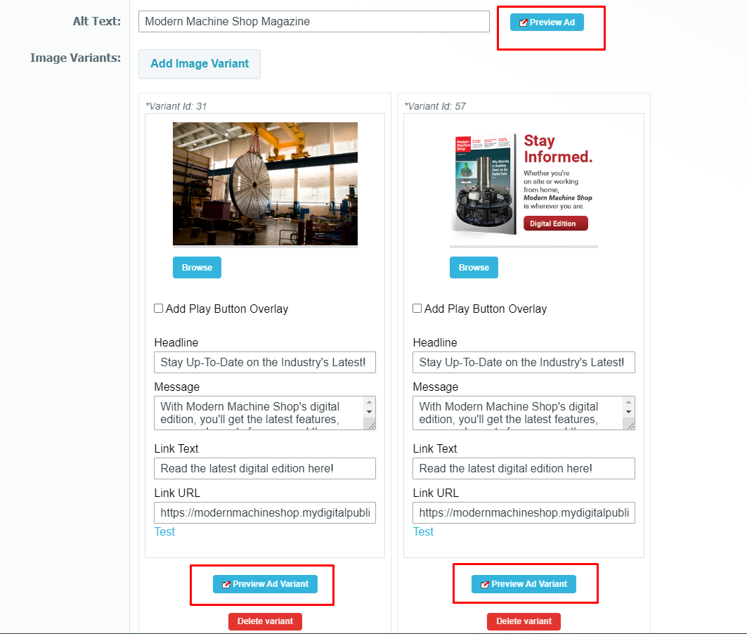
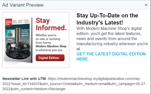
NOTE: This is using the saved Ad information. Changes from the current edit will not be used for this preview.
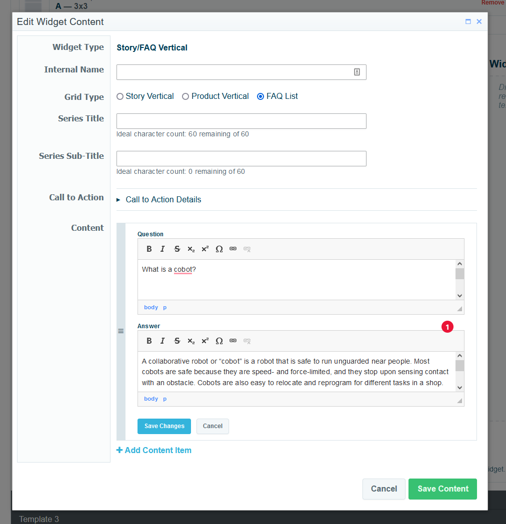
FAQ List Added to 5 Story Vertical Widget
Tom Gobich
A new Grid Type option has been added to the 5 Story Vertical widget within Build, called FAQ List. With this new Grid Type you can now define both FAQ Schema (for google) and easily list FAQ items on the (for the user) in one go as FAQ List items will be automatically added to the page's FAQ Schema.
The FAQ List Grid Type is limited to manually defining a list of questions and answers.
Additionally, the 5 Story Vertical widget has been renamed to Story/FAQ Vertical to better indicate that you can add FAQ items using this widget.
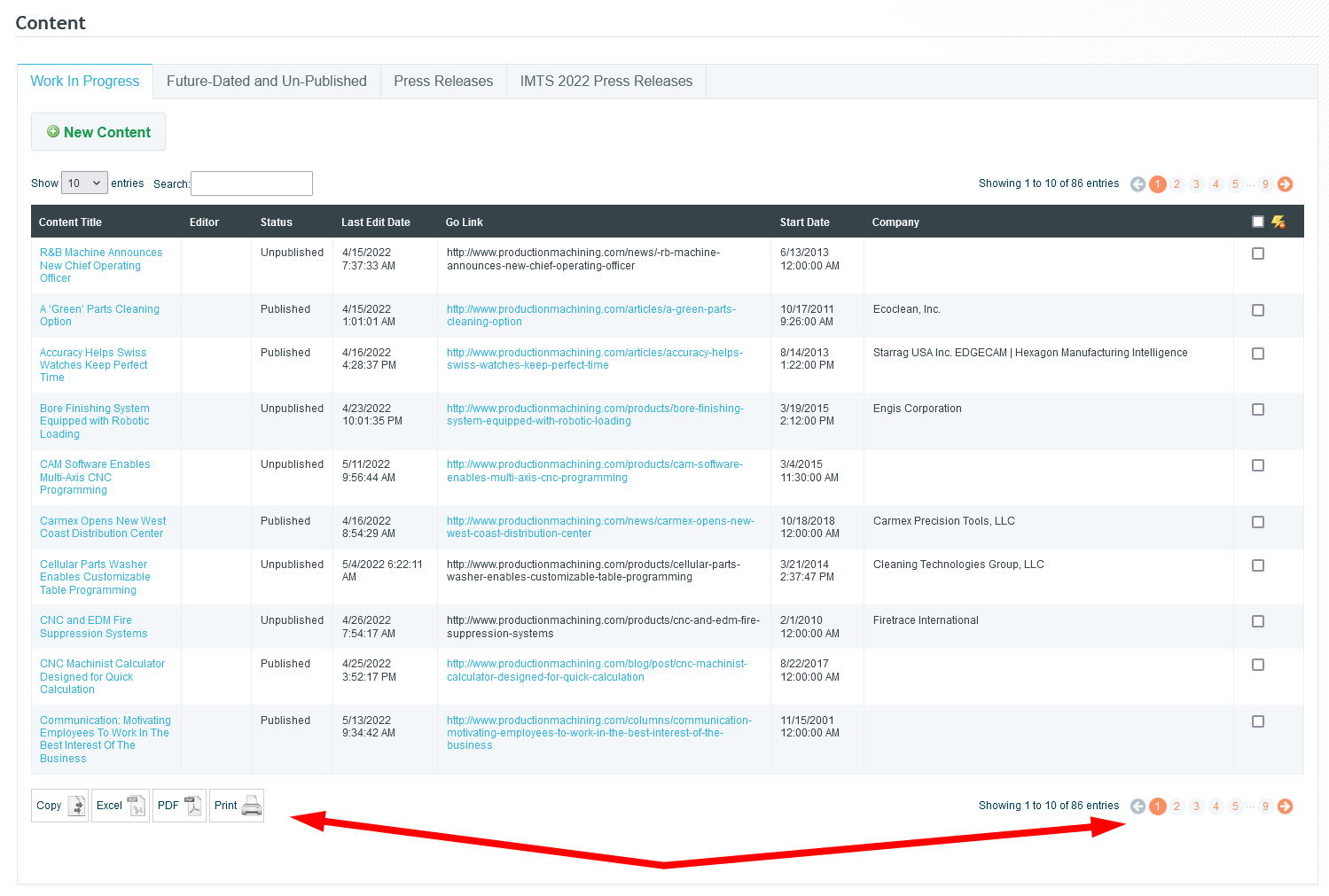
Data Tables Have Been Updated
Tom Gobich
Today we updated the library we use to put together data tables within Dash. These tables are those you find on the Content Work In Progress page and the like. Prior to today, we used a very outdated version of this library that was still attempting to utilize flash. Because of this the copy, excel, and pdf buttons didn't work and haven't since flash was removed by browsers a few years ago.
With the updated version of this library, flash is no longer required for these buttons. As a result, these buttons are now back up and working. This updated version also brings improved pagination, so you can directly jump to a particular page and even the last page.
This update impacts the following Dash pages:
- Content - Work In Progress & Future-Dated tabs
- Content Finder
- Authors
- Collections
Content Keywords
You may have noticed a new category in the edApp for Content Keywords. These keywords are not being used for SEO purposes, but rather are being used to pull related content for continuous scroll.
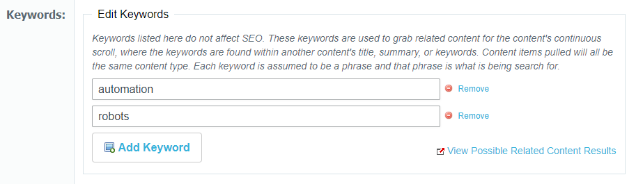
Each keyword is a search phrase that will use a cloud search to find matches in other contents' title, summary, or keywords. Less matches will be found as a phrase becomes more specific. For example, using "Wind Power" as a keyword will search for exactly "Wind Power" and not "Wind" or "Power" separately. All keywords have the same weighting and the content pulled will be based on relevancy score and how recent the content is.
The "View Possible Related Content Results" button is meant to aid with creating keywords. This will display a popup to show the top 20 Cloud Search results using the current keywords and content type. The continuous scroll content items used will be taken randomly from these top 20 results. The results only include currently published content from the last 2 years and whose starting date has already passed. Below is an example using the "Automation" and "Robots" as keywords and Products as the content type:
File System Links, File System Images, & Url Defense Links
Tom Gobich
File System Links & Images
File system urls begin with `file://`. These urls are paths to locations on your computer and are not accessible to anyone but you. Recently, we've seen instances where these file system urls have been used for both links and images. For images, we believe this is happening from copy/pasting or dragging & dropping images from the file system or Outlook emails directly into the content editor. For links, we believe the same thing is happening but with file system & Outlook locations.
In an attempt to prevent links and images from being inserted into content in the future we're adding checks for such urls when copying & pasting and dragging & dropping into the content editor.
With this now in place, when links are dragged & dropped or copy/pasted into the content editor and they go to a file system url, the link will be removed and just the text for the link will remain. Images on the other hand containing a file system url will be completely removed, as there's nothing usable to keep.
When this does happen, warnings will be displayed in the top-right corner of your screen. An example of one of these warnings is below. Checks for file system links have been added to the content creator and build.
Url Defense Links
In addition to file system links, we've also noticed Proofpoint Url Defense links have been getting used as well. Links received within emails are routed through Proofpoint so that Proofpoint can verify the url is safe before it reaches you in your inbox. In some cases, these have been entered for links and advertisements by copy & pasting links from emails. Below is what one of these links looks like.
https://urldefense.com/v3/__https://mastip.com/ __;!!KeUdynatPK5p!_1244v...
When clicked, these do take the user to the correct final destination, however, Google Amp considers these links invalid. Additionally, these links may expire after some time and stop working.
To prevent either of these situations, we've added a link check for these url defense links. When one of these links is entered, we'll strip out the Proofpoint Url Defense portion and replace it with the underlying link. When this happens, you'll be notified by a warning in the top-right corner of your screen. Please verify the link's correctness when this does occur.
This check has been added to the content creator, build, and the ad create/update form.
On Demand Webinars
Tom Gobich
A number of changes have been made to better support On Demand Webinars.
- An "On Demand" checkbox has been added to the webinar form in Dash.
- When unchecked, the form will display the same as before
- The Date & Time field and Embed Position field will disappear when checked. Instead, a Promotional Period field will display. You can use this to set what date range the On Demand webinar should be promoted. Additionally, the Embed Code field will switch from expecting a registration form embed to a video embed. The video embed will display the On Demand webinar within our brand sites.
- On Demand webinar's red action button will read "View Now" instead of "Register"
-
On Demand webinars within their promotional period will be displayed within the "New & Upcoming" section. They'll also be considered for newsletter pulling
Dash Image Library Search Bar
The Image Library Search Bar will now be reset to an empty state when opening/re-opening the Image Library. The Search Bar will also now have a blue background color when the Image Library is filtering on the search Bar. These changes were added to hopefully solve an issue where the image library looks empty after inserting a few images, which I believe was caused by unintentional filtering.
The below pages were impacted by this bug, though it was most prominent on the content creator. The bug has now also been fixed on each of the below pages.
- Content creator
- Event editor
- Issue editor
- Build editor
- Link editor
- Zone editor
Dash Image Library Select/Insert Bug Fixed
Tom Gobich
A bug impacting performance and the ability to insert images into the content body within the content editor has now been fixed. This fix also resolves the issue where the image caption was getting applied numerous times.
The issue stemmed from a new "change" handler getting bound to the Image Library every time it opened. This bug has been around for a while and copy/pasted throughout Dash but only recently began manifesting itself when a new feature was introduced to save and load alt text, caption, and other image information as this slightly slowed down the "change" handler's completion time.
The below pages were impacted by this bug, though it was most prominent on the content creator. The bug has now also been fixed on each of the below pages.
- Content creator
- Event editor
- Issue editor
- Build editor
- Link editor
-
Zone editor
Build Bust Cache
Tom Gobich
If you ever run into a jam and your page is incorrectly loading outdated information or even stuck on an error, you can now try busting the page's cache directly from Build. This is a new option added onto the page's context menu within the Microsite's edit page.
Content Creator Updates
Tom Gobich
Updates to the Content Creator have been in the works and finally went out this morning. Most of the updates are improvements to the code, its structure, speed, and re-usability. Minimal changes should be visibly noticeable, however, you should notice a decent improvement in page load speed.
This update focused on the right-hand side of the page (taxonomies, structure, related suppliers, issues, etc). This portion has been re-written and the tree-based structures have been moved off the page load and now will load on request. They'll also begin to load if you hover over the card for a short period of time as this shows an "intent to click". For example, if you hover over issues, but don't click it, after 200ms the tree contents for being to load in.
One thing you may notice is in regards to the issues section. Previously this section was loading all issues for all brands, which was a significant slow-down in terms of load times. The issues section will now only load the past three years for each brand. For example, this means currently only 2022, 2021, and 2020 will be displayed.
I've spent a good chunk of time testing these updates to ensure they don't break anything, however, should you experience any issues please let me know and I'll see to it that the issue(s) are fixed!
Content Anchor Tool
Tom Gobich
The anchor link tool has been added back into the main content's WYSIWYG editor (flag icon). To use it follow the below steps.
1. Select the text you'd like to be the scroll target.
2. Click on the flag tool, shown below next to the link tool.
3. Enter a name for the anchor target. Keep the name simplistic. It should be alphanumeric and CapitalCase, camelCase, or snake_case.
4. Click "OK". Note that a flag icon will be added next to the text within the content body.
5. Select the text you'd like to link to the scroll target.
6. Click the link tool.
7. Change the "Link Type" to "Link to anchor in the text"
8. Select the anchor by name or element id.
9. Click "OK". Note that the text will appear as a normal link. Once clicked, however, instead of changing the page the user will be scrolled to the link's selected scroll target.
Build Ad Shuffle & Positioning
Tom Gobich
Ad Shuffle
A new flag has been added underneath the ad collection field within Build to turn on/off the shuffling of ads. This new flag has been defaulted to on (checked) for all preexisting microsites since this was the default behavior prior to the addition of this flag.
For example, in the above screenshot, the "shuffle ad order" checkbox is unchecked, so the ads will pull and display in the order they're listed within the ad collection.
Ad Positioning
I've also fixed an issue related to ad positioning. We have a script that checks whether or not an advertisement will fit next to a microsite's template. If it doesn't the script will move the ad down to the next template to prevent adding whitespace to the template's content.
Prior to today this script was using the advertisement's native image size instead of the size the image is displayed at when determining if an ad would fit. When the ad's native size was big enough, this was causing the ad to be moved to the next template in some cases where it didn't need to be. This script is now using the image's display dimensions instead of the native dimension's so this should no longer be happening.
Removing Image Library Delete Action
For the foreseeable future, the delete option for images and folders in the image Library has been removed. This functionality has been removed as there have been instances of images being moved or removed causing the images to disappear from the content containing them.
Starting this February (earlier this month), direct access to the CDN has also been limited to avoid these issues. This can only fix images "Disappearing" for those images/folders added to the image Library after these updates. Prior to these changes, Images that have already been moved or deleted from their desired location may still be seen in content due to being cached. These cached images may last for up to 120 days, though will eventually return "404 - File or directory not found."
Event Calendar
Tom Gobich
A calendar view for events has been added to Dash. You can find it on the Events page within the Calendar tab. By default, the calendar will show events across all sites and will show both events and webinars. However, you can filter down by one or more sites and one or more specific event types.
When you double-click on an empty space within the calendar, a modal will pop open with three action options.
1. Create Note, which is the default option. With this you can add a note to a specific day.
2. Create General Event.
3. Create Webinar.
Applicable fields will display depending on the selection. When creating a new event or webinar, once you hit save the event/webinar will be created with the name, start, and end date (if applicable). Once the event is successfully created, you'll be redirected to the full event/webinar edit screen so you can complete the remaining applicable fields.
This is partially still in progress, I'm looking into why events aren't displaying within the day and week views if the event spans more than one day. Though, this may just not be supported by the calendar library we're using.
---
Update: 2/14/22
Multi-day events are now properly displaying within the day and week views on the calendar. I've also added color differentiation between general events (blue) and webinar events (teal) and improved the link coloring for each. Lastly, a US/MX prefix has been added to note whether an event is for US or MX brands.
Webinar Updates Part 2
Tom Gobich
Default Sponsor Logo
When you add a new sponsor to a webinar, the system will check to see if the sponsor's showroom has an attached logo. If it does, it'll default to using the sponsor's showroom logo. When this happens and the showroom logo is being used, a note "Defaulting to Showroom Logo" will be displayed under the logo.
This can be easily replaced by selecting a different logo from the Image Library.
Presenter Updates
The presenter form has been completely reworked. The form's length has grown since it was initially created and the presenter descriptions are longer than I had initially imaged them to be. Due to these reasons, I've moved the presenter form off into a modal. This gives both the presenter preview and the form more horizontal room so that both aren't squished next to one another.
To add a presenter, now click the "Add Presenter" button in the top-right corner of the presenters section. This will open the modal.
Also new is the ability to search and select a presenter that's already been entered into the system. To differentiate between the two there's now a "What would you like to do" question prefixed to the top of the form when adding a new presenter. This will not display when editing a presenter. The old form will display when selecting "Add a new presenter".
Webinar & Event Updates
Tom Gobich
A fresh batch of webinar and event updates went out today for all sites. Details are below.
Sponsors
The Sponsor(s) section was altered to allow multiple sponsors to be entered within Dash and displayed on the detail page. When a sponsor is selected there will now be a new logo field specific for that sponsor. This new logo field replaces the old "Sponsor Logo" field. On already entered webinars the "Sponsor Logo" field will remain visible, though renamed to "Legacy Sponsor Logo". On newly created webinars, or webinars updated to use the new sponsor-specific logo field the legacy sponsor logo field will be removed.
Additionally, sponsor logo alt text will now default to [Company Name] + Logo.
Lastly, for the sponsors, the autocomplete was changed to include all supplier directories. Results will be grouped by the directory and the same company may appear under different directories. Please be sure you're selecting the correct company under the correct directory.
Presenters
The presenter image field now uses the Image Library. Additionally, the image editor has been added here with a 1:1 ratio crop (square crop). A simple WYSIWYG has also been added for the biography field consisting of bold, italic, and link tools. If more tools are needed here, please let me know. Lastly, the edit and delete buttons for the presenter's positions were changed (non-visually) to give the biography preview more space.
Misc
- All image fields for webinars and events have been switched to the Image Library.
- Fixed an area where the alias tool wasn't rigged up correctly (featured events)
- Fixed how events that start and end on the same date are displayed, they'll now display October 13 instead of 13 - 13.
Image Library
A fix has been deployed for the Image Browser for WYSIWYG editors and the Media Library. One issue that has been fixed was the creation of multiple instances of the Image Library. This was causing actions, like delete, to be performed on images other than what was currently selected. For delete, the popup now will only be displayed for the currently selected image. Another issue that was fixed was the create and delete options for images failing to properly complete. This caused them to be repeatedly performed, sometimes reverting previous actions. Both of these issues have been fixed and the Image Library is working as intended.
Cursor Jumping & Undo/Redo Scroll Position
Tom Gobich
A fix was deployed this afternoon to fix an issue with the Change Detection plugin on the WYSIWYG editor. This issue occurred when you double-clicked a word to select it with change detection enabled and started typing to replace that word. In some cases, the cursor was jumping to the end position of a sibling element within the paragraph. The cursor will now properly remain at the start or end boundary of the word being replaced. This fix is in place for all current and future content.
Another issue has also been fixed with the undo/redo functionality. When hitting undo or redo, the content would flash and you could end up at a completely different portion of the document then you were before. With this fix, the content will still flash since undo/redo works off stored snapshots of the entire document. However, the position is now properly maintained and you're no longer jumped to random portions of the document. This fix will apply to all future content. This issue was found when investigating another issue with the undo/redo functionality where in rare cases undo would go back more than one step. We're still investigating that issue.
Photo Credit
Tom Gobich
Starting today, when you add a photo credit onto an image used with the WYSIWYG body copy, that photo credit value, alt text, and caption will be stored within the database. If you then select that same photo from the Image Library, the previously used photo credit, alt text, and caption will auto-populate into the Add Image fields.
When an image has the photo credit populated from the last usage, a blue alert will be displayed just underneath the image preview. If you change the photo credit, alt text, or caption for this usage the new values will be stored for the next time the image is used. If you remove the auto-populated photo credit value completely, the previous photo credit will remain intact for the next usage.
Also, a fix has been applied when the WYSIWYG editor is in fullscreen. Previously you had to move the modal upwards to reach the "Insert Image" button, even with scrolling inside the modal. Now, when you select an image the modal will recenter itself, making the max-height applied to the editor more useful and allowing the Insert Image button to be reached without having to move the modal upwards.
Fullscreen Related Supplier Management
Tom Gobich
When the content editor WYSIWYG is fullscreen, the related suppliers panel is now visible and pinned to the bottom-right corner of your screen. This allows you to add and remove related suppliers without leaving fullscreen. Changes here will then immediately reflect within the "Insert Supplier Link" dropdown in the WYSIWYG toolbar. When you exit fullscreen in the editor the related suppliers panel will return back to its original position.
Content Pin to Home Top
Tom Gobich
You can now pin a content item to the top of the home page for a period of time by specifying a future date to the "Pin to Home Top Until" field. When left empty, the content will be populated onto the home page as usual. When the pin to top date is in the future the most future-dated content item for this field will be pinned to the top of the home page. This applies to both content with and without a landscape image. When the content has a landscape image it will pin to the top in the first landscape position, otherwise, it'll pin to the top for the normal content.
When the pin to top date either enters the past or a new content item is posted with a pin to top date that's further into the future, the content item will drop back into the normal flow as though the pin to top date wasn't specified.
Build & Content Marketing Dashboard Strip Content Shuffle
Tom Gobich
A new shuffle field has been added to the Photo Series and Color Series strips both within Build and the Content Marketing Dashboard. When "Shuffle Content" is checked, the order the content is pulled will be shuffled on each load. So, when you refresh the page an item that was appearing in slot 1 may move to slot 2 or 3 since the order will be shuffled. When unchecked, the order will remain as you've defined it.
Things to note...
- When a taxonomy pull is selected on the "Content Selector" the shuffle setting will be ignored for performance reasons.
- When "Manually Insert Content" is selected, clipboard items will not be included in the shuffle.
- Within Build, strips will default with shuffle set to off.
-
Within the Content Marketing Dashboard, strips will default with shuffle set to on. However, all currently existing strips have been defaulted to off.
Content Marketing Dashboard Strips, Active/Inactive
Tom Gobich
The Home & Zone Strips on the Content Marketing Dashboard now have an active/inactive toggle. When a strip is active, so long as it has a Pull Type, it'll be displayed at it's position on either the home or zone page(s). When a strip is inactive the strip won't be displayed and instead the fallback content for the position will be displayed, whether that's a featured item or a dev-maintained strip.
When you assign a strip to a position, the strip will be created and marked as inactive. This will allow you to make your selections and populate the content for the strip before it begins to display on the home/zone page. Once you're ready for your strip to be displayed, click the "Inactive" button to toggle the strip to "Active" and the strip should immediately begin displaying.
Dash Status Page & Indicators
Tom Gobich
Dash now has a dedicated status page and indicator as a way to notify you whether we're aware of any current issues, performing maintenance tasks on any particular page, or even just investigating or monitoring a potential issue.
All pages now contain a Dash Status indicator in the top-right corner of the page. This sits just below the Dash Changelog button. This status indicator will display to you the current overview status of Dash as a whole. If there are any pages within Dash experiencing issues or under maintenance this will change to reflect the current worst active issue, whether that be "Experiencing Major Outage(s)", "Experiencing Minor Outage(s)", "Performing Maintenance", or "All Systems Operational".
All statuses are color coded.
- Major Outage = Red
- Minor Outage = Orange
- Maintenance = Gray
- Operational = Green
If you click on the Dash Status indicator, it'll take you to Dash's Status page in a new browser tab. Here you can see all active incidents and the past 90 days' worth of previous incidents. You can also see whether an incident is being investigated, worked on, monitored, or has been resolved. Incidents on this page also highlight whether the severity of an incident has changed at all from its initial severity, for example moving from a major issue to a minor issue.
Lastly, if a page you're currently on is experiencing an incident, a message will be displayed in the bottom right-hand corner of the page containing information about that incident. It'll state its severity and whether it's being investigated, worked on, or monitored. These messages are dismissible and once you dismiss a message it'll remain dismissed for you for the browser you're using.
Here's the status indicator, highlighting "All Systems Operational"
Here's the Dash Status page, with an example incident added onto it.
Here's the page's message for it's active incident.
Here's more examples on the Dash Status page.
Quick Links & Dash Training Improvements
Tom Gobich
On the Content Marketing Dashboard the Quick Links and Dash Training management options have been improved for those that have access to manage these sections.
First, the edit, add and delete buttons are hidden when an item is not being interacted with to cut back on visual clutter. You can now hover over an item and these buttons will become visible for those that have access to perform these actions.
Second, you can now drag-and-drop the links and whole groups to reorder them. You can also use this to move an item into or out of a group as well. Previously you would've had to delete the item then recreate it to move it into or out of a group.
To move an item hover over it to display its action buttons. Then, click down on the drag handle, highlighted below, and move the item where you'd like it. A purple shadow will show where it will save to when you release your click. When it's where you'd like it to be, release your click.
Latest Issue Strip Is Now Available
Tom Gobich
A Latest Issue strip has been added to both Build and the Content Marketing Dashboard. This widget accepts a title, title logo/icon, background image, property selection, and link behavior.
If you provide a background image, the image will be displayed similar to how it's displayed with the photo series strip. If a background image is not provided it will display the same as a color series strip.
Similar to the latest issues carousel, you can select a single property to pull the issues from or you can pull from all properties. When pulling from a single property the latest four issues will be pulled. When pulling from all properties, a carousel of the latest issue for each property will be displayed.
As for the link behavior, you can either select not to link, link to the displayed issue's digital edition, or link to the site's article page.
The above is how it displays when selected via the Content Marketing Dashboard.
Above is how it's displayed within Build.
Build, Grouping Edited Images
Tom Gobich
Edited Image Placement
When editing images in Build in the past the edited image used to save directly into the same folder as the original image. Now, when editing images, if you apply a crop transform to the image the edited image will now be placed inside a sub-folder named after the cropped aspect ratio.
For example, if I upload a 16:9 image to my Microsite, example-microsite, and crop it to fit a 3:2 widget, the new altered 3:2 image will be placed inside a folder called 3x2 at /brand/PM/build/example-microsite/3x2. (x is used in place of : because : isn't url-safe).
Default Widget Image Library Folder
If a Microsite has a sub-folder named after the aspect ratio the widget supports, for example 3x2 for a 3:2 aspect ratio, the widget's "Browse Image Library" will automatically open within that aspect ratio's folder. If the Microsite doesn't have a folder yet for the expected aspect ratio, then it'll open as it did previously inside the Microsites folder.
Alias Is Now Required To Create A Microsite
To aid with the behaviors defined above, you now must provide an alias for your Microsite during the creation process. This ensures the Microsite has a sub-folder within the Image Library to allow the above two behaviors to occur.
Unique Filenames
Previously, timestamps (numeric representation of the datetime) were prefixed to the filename when uploading an image using the "Browse Computer" button. Additionally, when editing an uploaded image a timestamp was added to the end of the filename. This behavior is now normalized and the timestamp is placed at the end of the filename for both, delimited by a dot.
So previously an uploaded and edited image's filename might look like this:
1633094956353_mmsmx_zone_software_1633095076789.jpg
Now it'll look like this, which will make it easier to find images by their name:
mmsmx_zone_software.1633095076789.jpg
Additionally, when editing this image the existing timestamp will be replaced with an updated timestamp for the newly edited image version, preventing the duplicate timestamp that was previously occurring.
Build Image Transparency Grid
Tom Gobich
A transparency grid, common with photo editing software, has been added to Build's image previews to fix a couple issues.
- Fixes an issue where white images are invisible due to blending in with the white background
- Fixes an issue where you can't tell if an image has a white background in areas needing transparency
For example, prior to this change this VMA logo was completely invisible. While still not entirely legible, you can at least now tell that there is an image, what the image is, and that it has transparency.
When an image doesn't contain transparency, here this image has a white background, the transparency grid won't be visible at all.
Color & Photo Series Strips Title Logo/Icon
Tom Gobich
Within the Color & Photo Series Strips a couple new fields have been added to add the ability to add a logo or icon before or after the Strip's title.
The image will be capped at 45 pixels tall to prevent it from overbearing the actual title and it's recommended for the width to be anywhere between 50-150 pixels. In most cases, you're also going to want the image to have a transparent background. Note that JPG files do not support transparency.
Here's how it looks on a Microsite in Build
Here's how it looks when used in the Content Marketing Dashboard on a Home or Zone strip.
Build Fixes & Improvements - 9/24/21
Tom Gobich
Bug Fixes
Most of these bug fixes are edge cases that require a certain flow to be followed in order to have run into them. However, always better to have them fixed than lingering around.
- Fixed an issue where you couldn't edit a widget if the Microsite's alias in "Basic Info" was empty.
- Fixed a cache issue where if you previewed a public page and the previewed version got cached, when viewing the public version it would use the preview cache resulting in the menu linking to preview pages.
-
Fixed a cache issue when linking to another Microsite or Microsite page inside Image + Head + Deck, Head + Deck, or a manual field in the Story Grid. If the linked-to page is private/in-review on the current cache then made public the widget was failing to update accordingly resulting in the widget not displaying on the public version.
New Features
-
You can now swap strip positions on a page. For example, you can swap Strip 1 with Strip 3 and visa-versa. There is a new button within the strip template panel called "Swap Position" that will ask you which position to swap with, then initiate that swap.
-
You can now change the visibility of all pages at the same time by clicking the root page in the Pages tree to open its context menu. A new option resides within the context menu called "Change Microsite Visibility" that, when clicked, will open a modal asking what to set the visibility to for every page in the microsite.
-
You can now instruct Build to tell search engines not to index a Microsite or Microsite page. A new checkbox has been added within the "Basic Info" and "Page Info" panels called "Exclude From Search Engine Index" that will add a meta tag to the page containing "noindex, nofollow" which will instruct search engines not to index the page so the page won't display within search engine results.
Enhancements
- When you clicked "Edit Content" on a widget it used to take a second for the page to open the modal because it waited for the modal to be ready before displaying it. Now, when clicked, the modal will open immediately and show "Loading" to signal that the click actually worked and something is happening. Then, once the modal is ready "Loading" will be replaced with the edit form.
- When changing the "Content Selector" radio selection in a widget edit form it used to take a second for the old selection's fields to be removed and replaced with the new selection's fields. Now, when changed, the old fields are immediately removed and replaced with "Loading". Then, when the new selection's fields are ready "Loading" is then replaced with those fields.
- The styling on the page's menu has been slightly tweaked to fit more characters on a line before line-breaking, provide better contrast on hover, reduce the massiveness of the drag-and-drop icon.
- The styling on the page menu's context menu (what displays when a page is clicked) has been slightly tweaked to improve contrast and fit more items vertically in a smaller area.
Build, Sponsored Annotation
Tom Gobich
A new field group has been added to Build's "Basic Info" panel for Microsites called Sponsored.
This field group contains two fields. The first is a checkbox that allows you to mark whether the Microsite should show a "sponsored content" annotation. When checked, the second field is displayed called "Sponsored Text" which allows you to define what text should be displayed as the sponsored annotation. This defaults to "Sponsored Content".
When checked, the provided sponsored text will be displayed above the company information on the right-hand side of the Microsite on desktop. On mobile, it'll display just under the Microsite's navigation toggle. This will be displayed for every page of the Microsite.
Build Locked Aliases
Tom Gobich
Dash Administrators now have the capability to lock/unlock the alias value within Build. When an alias is locked its field will be disabled and can't be changed until unlocked. An alias can be locked at the root and page level.
This was added for a couple of reasons.
-
Some Microsites, especially those on GardnerWeb, utilize manually defined routes in our code-base (removing the /kc/ and /zc/ from the URL). These manually defined routes are mapped to the Microsite's defined alias value in Build. For that reason, if someone were to change the alias value in Build it would break the manually defined route completely. Now with alias locking, we can remove that possibility by preventing the alias from being changed on those particular Microsites.
-
Some Microsites are now embedded on non-build pages, like the contact pages. These too make use of the defined alias value within Build to specify which Microsite to embed. Locking the alias value in Build here prevents the same thing from occurring on these embedded Build pages.
Build Team List Link Option & Edit Page Panel
Tom Gobich
Team List Link Option
Within Build, the Team List widget now has a new option to allow linking for a team member. This option is only available for the Grid and List layouts. The Grouped layout utilizes the email field for linking.
The Link field has three options
-
Don't Link - This is the default, in which the team member won't have a link
- Link To Author - Only displayed when selecting an author, will link to that author's page on the site
- Define Manual Link - This allows you to manually define a link for the team member.
When "Define Manual Link" is selected an additional field to provide that link will be displayed.
Edit Page Panel
Also added with build, though not really a Dash change, is a new panel displayed on Build pages when you're logged in. Note this is not visible to our users. This panel sits in the bottom-right corner of the screen and provides information about which Microsite you're in and which page within the Microsite you're in.
If you have access to edit the Microsite there will be a link in this panel to go directly to the Build edit screen for the current page you're on.
Displaying ad collections each ad is associated with
A list of the ad collections each ad is in is now being displayed on the ad collection edit page. Each collection name is a link and will take you to that ad collection's editor.
Build Search Toggle and Structured Data
Tom Gobich
Search Toggle
Within Build, you now have the capability to remove the search box at the Microsite level within the Basic Info panel. This can be toggled via the "Show Search" checkbox, which defaults to checked.
When checked, the search box will display as it did previously in the Microsite's header area. When unchecked, the search box will not be displayed, which may be ideal for small or single-paged Microsites that won't benefit from have search.
Structured Data
Build will now automatically generate Structured Data information for Google. This will help Google better understand the page and it's purpose. To aid in selecting the correct type of Structured Data to generate there's a new field added within the Basic Info and Page Info panels called Page Type. Please use this field to select the type that's most applicable to the page you're building. The default selection here is "Web Page", which will be the most commonly selected. Other supported types include Questions and Answers, Frequently Asked Questions, Collection, About, Contact, and News Article.
Selecting News Article will generate Structured Data that's very similar to what's used for our actual article pages. this is to be selected if the Build page consists of one or more WYSIWYG widgets that comprise a complete article post.
Content Marketing Dashboard - Phase 1
Tom Gobich
The Content Marketing Dashboard has been re-imagined. The dashboard is now broken up into four different sections. Links, Site Maintenance, Social and Push, and Trello.
-
Links - Consists of Quick Links and Dash Training links. Quick Links will be brand specific links unique to a brand's dashboard, while Dash Training links will be the same across all brand dashboards.
-
Site Maintenance - Consists of Featured Content, Read Next, Resources, Home Strips and Zone Strips. Featured Content will only display for the Custom Content team. Read Next and Resources now have an "Overdue" status countdown to help prevent content from becoming stale. Resources can now be pulled from a collection of Dash content, a taxonomy selection, or manually inserted. Home Strips and Zone Strips are brand new. You can assign up to three home strips and one zone strip. This allows you to select between a Color Series strip or a Photo Series strip. These strips work very similar to the strips within Build.
-
Social and Push - This section has been converted from one single table containing future dated items to four sections, this week, this month, future, and past 6 months. Coming in Phase 2 will be the inclusion of push alerts.
-
Trello - Another new section to the dashboard is Trello. This requires you to login and authorize Dash to access your Trello boards and cards. Once authorized a read-only version of Trello will be displayed within your Content Marketing dashboard.
Dash Change Detection Was Including Edits When Copy/Pasting
Tom Gobich
Previously, when change detection was enabled in the body WYSIWYG editor, if you removed or altered characters then copy/pasted the text the removed characters would be pasted back in. This issue is now fixed and the removed characters will be excluded from the pasted text.
Image Full-Resolution Lightbox
Tom Gobich
When adding an image into a content body, there is a new option to "Include Full-Resolution Popup". When "yes" is selected the image will be inserted with code to enable the full-resolution popup. When "no" is selected the image will be inserted same as always.
Note "yes" should only be selected if you've uploaded a
high-resolution image.
Note the popup will not work if the image contains a link, as the link will
take the user to the link's destination.
Here is where you can find the option to add a full-resolution lightbox when adding an image to your article
Here's an example of how the lightbox will appear when activated within the article.
Auto-Detect & Pull First 3:2 Image
Tom Gobich
Starting for images placed in content bodies July 9th onward. When pulling an image from the body copy for usage on pages like the home page the system will now search for and use the first 3:2 aspect ratio image, or one very close to 3:2. So, if a 2:1 image is displayed first in the article followed by a 3:2 image halfway down the page the 3:2 image will be used instead of the 2:1 image.
This only applies for images place July 9th and onward because images will now have their native dimensions data applied to the image which is what's used to determine the aspect ratio.
In this example, note the image being pulled when linking to the article, which is boxed in red, is the third image to display within the actual article. This image is the one that's pulled because it's the first image within the article that's a 3:2 aspect ratio.
 Powered by ChangeCrab